Let your AI agent set up SaaSFlow
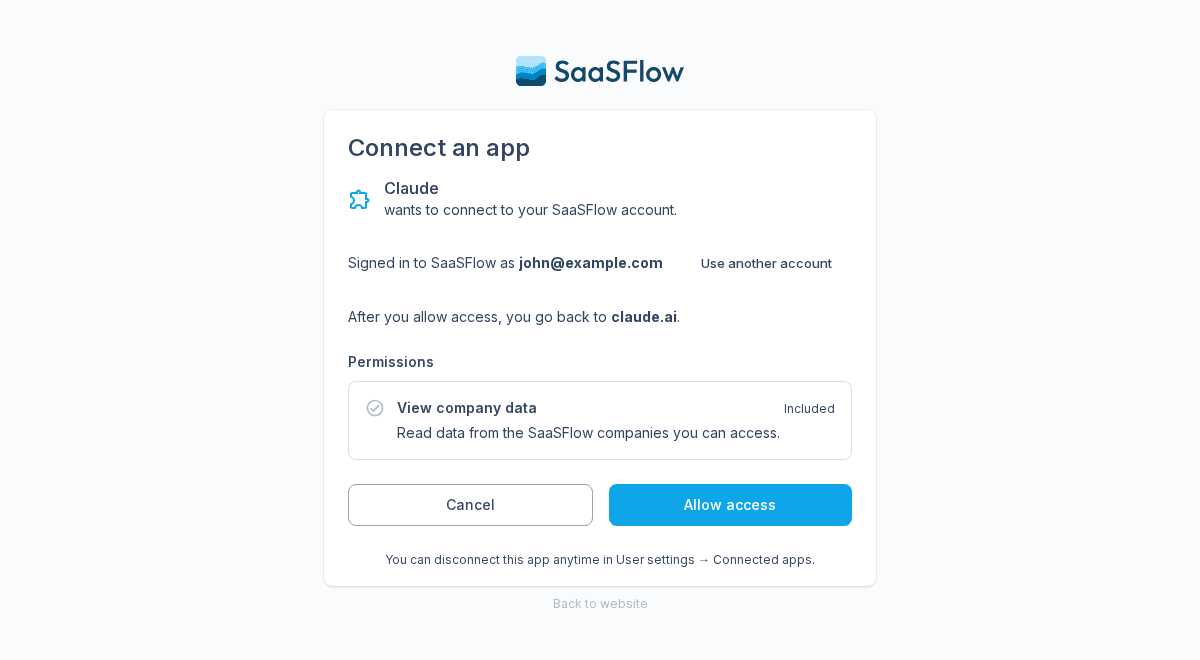
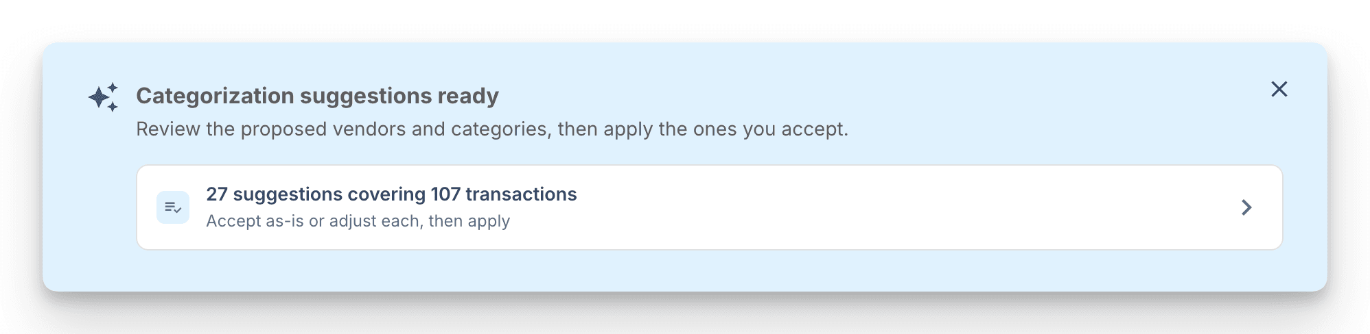
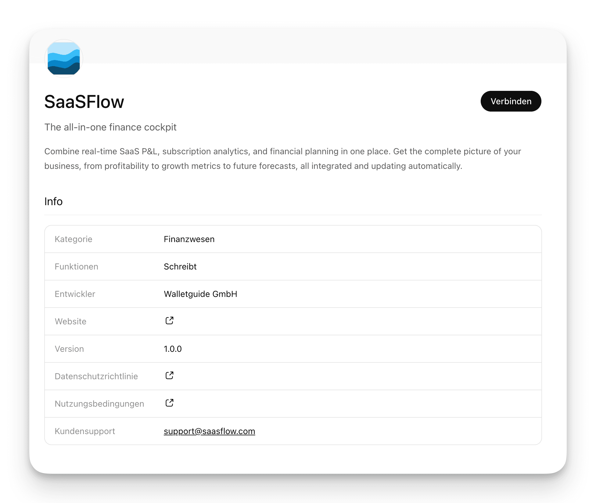
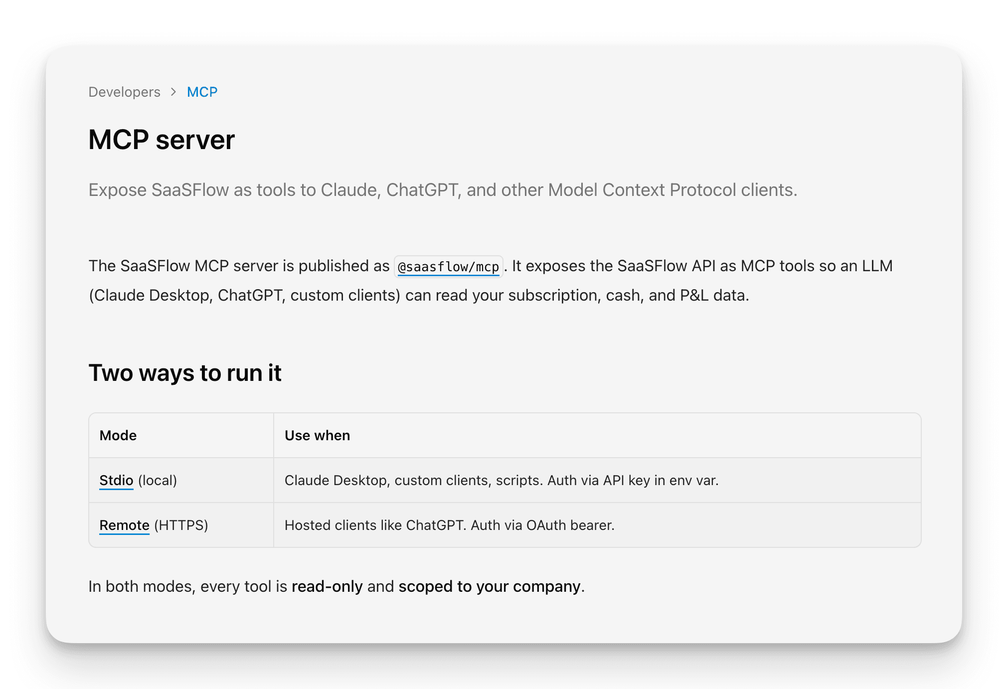
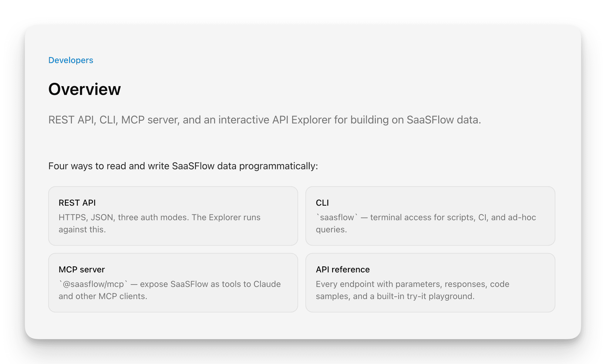
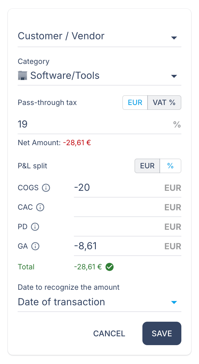
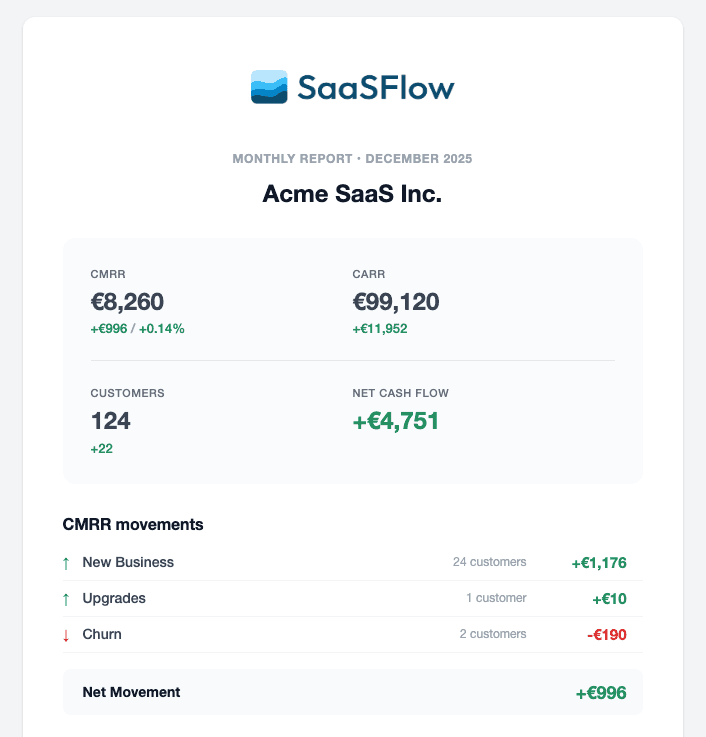
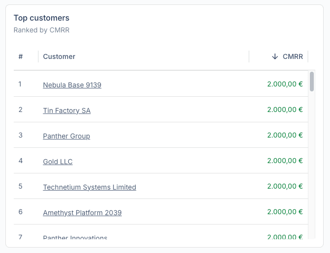
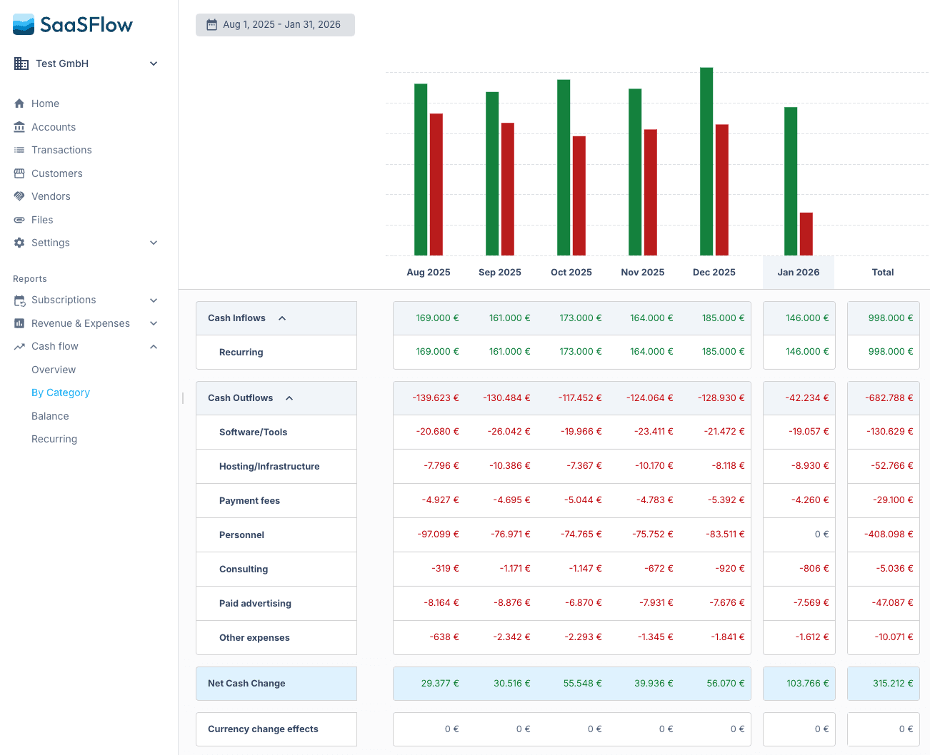
Connect Claude, ChatGPT, Cursor or Codex to SaaSFlow and ask it to set up your company. The agent creates the company and sends you the links to connect your data. Then it helps you categorize transactions and plan the forecast. No account yet? You can sign up while you connect.
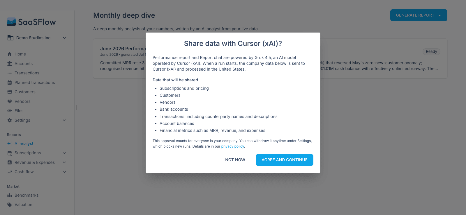
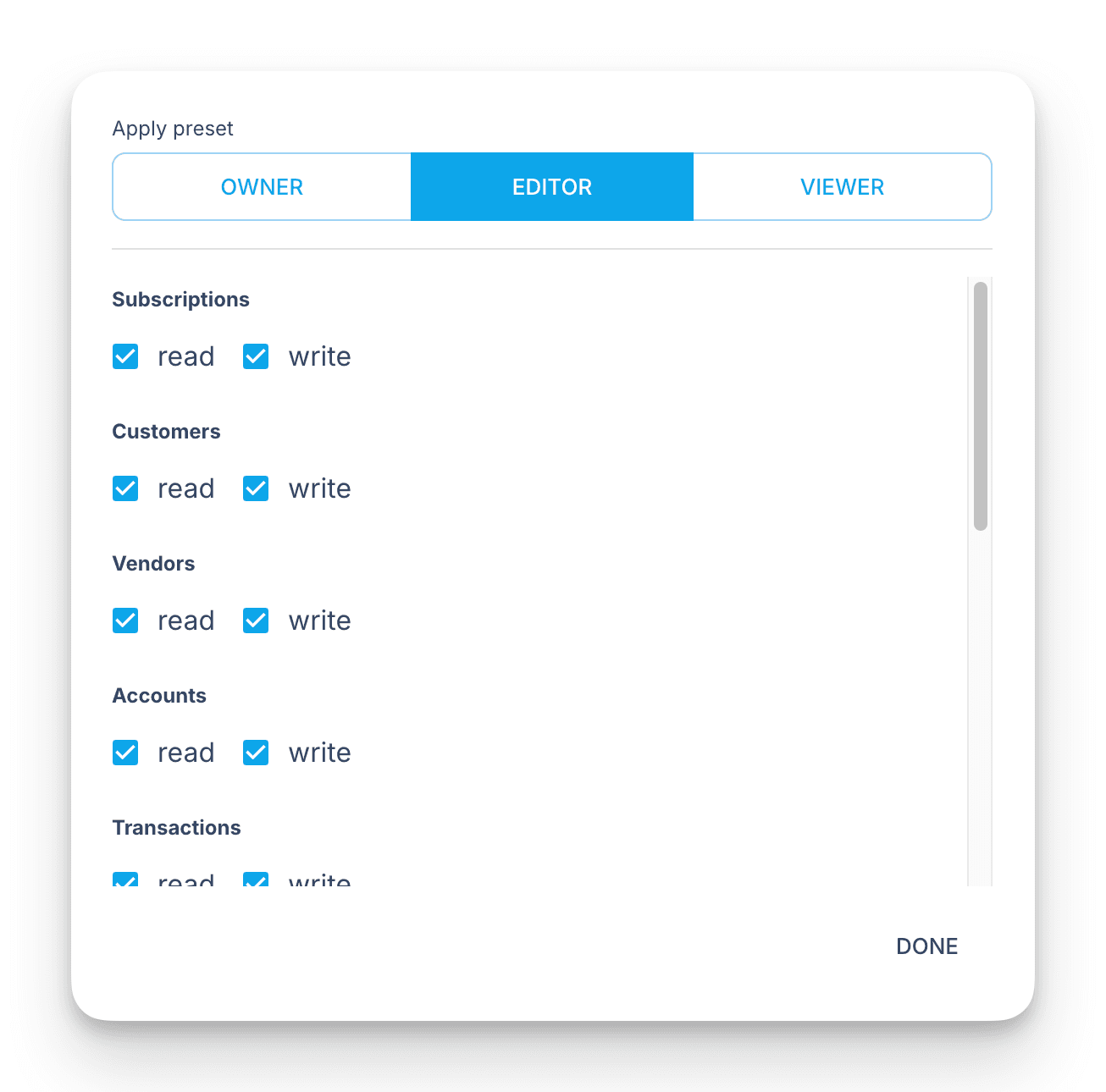
- The consent screen asks what the agent may do beyond reading: change company data, manage settings and integrations, create companies. To change that later, disconnect and connect again.
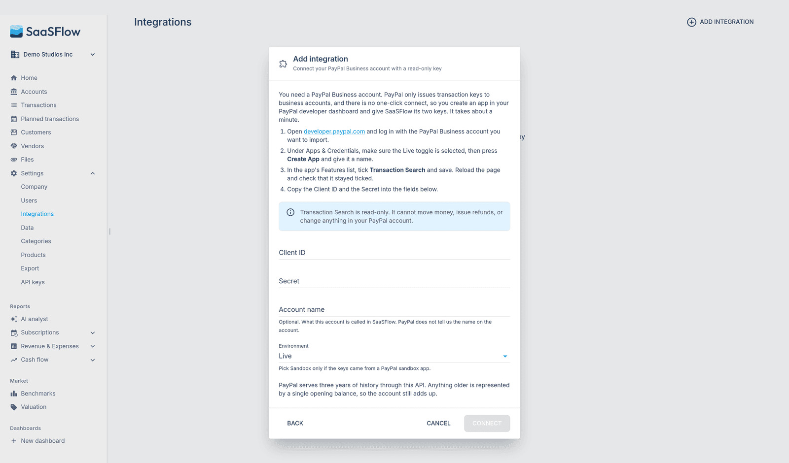
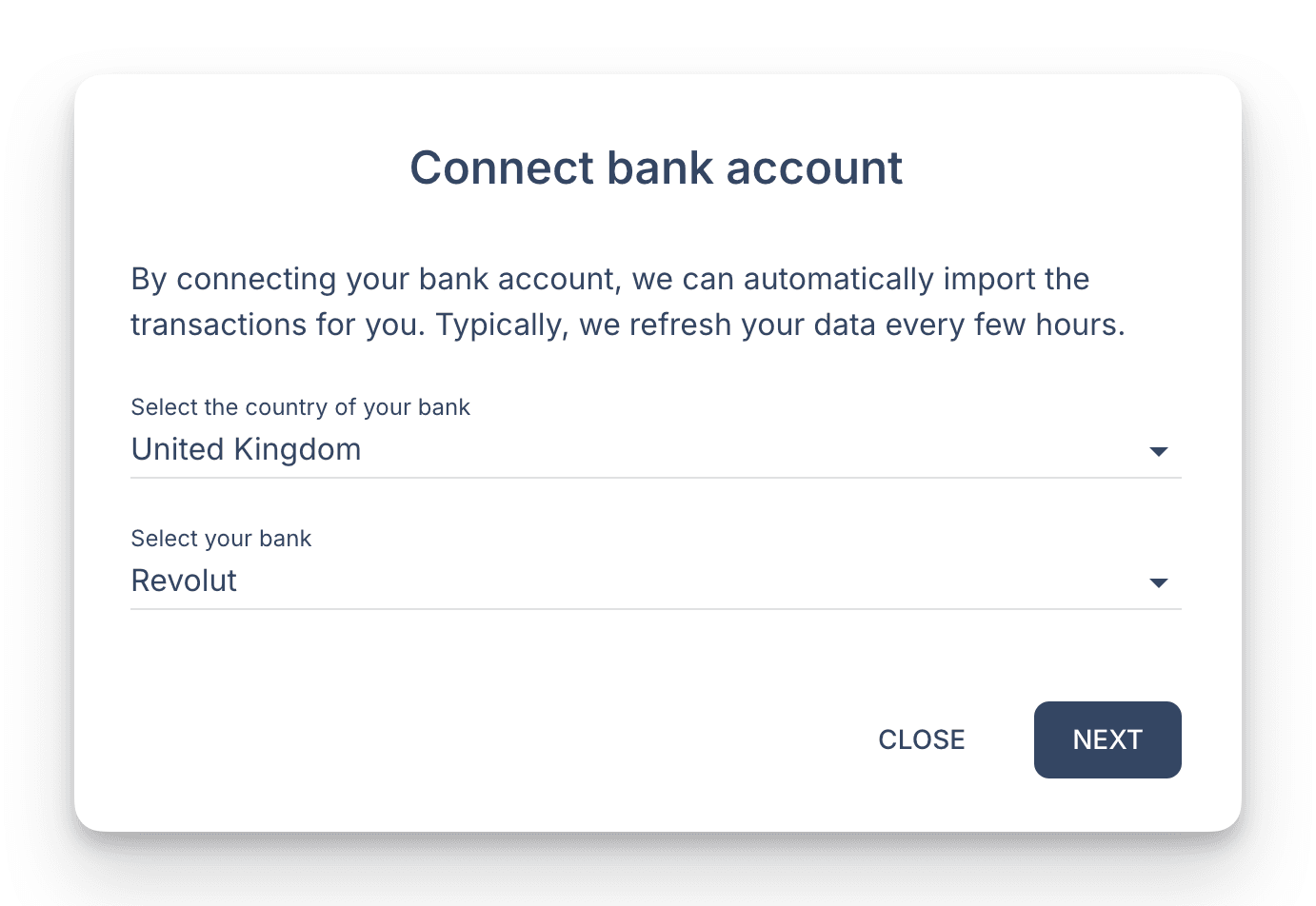
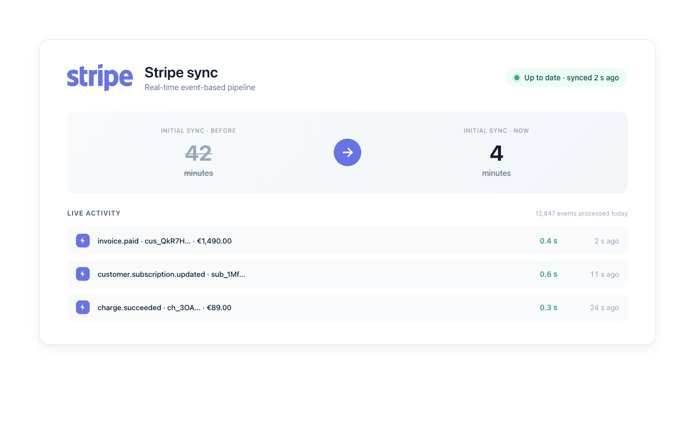
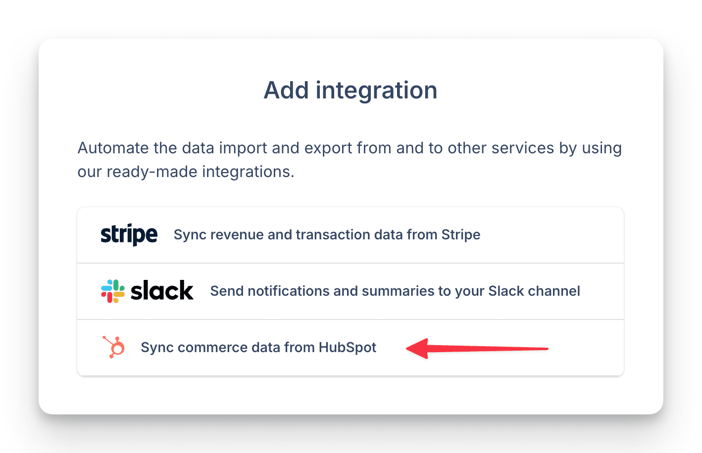
- You connect Stripe and your bank yourself, through links the agent sends you. It never sees those credentials. For billing, it sends you a link to the billing page.
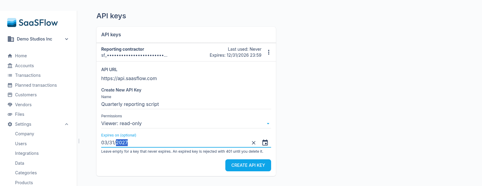
- Invitations, role changes, API keys and deleting the company stay with you. The agent asks, and you approve the exact change in SaaSFlow.
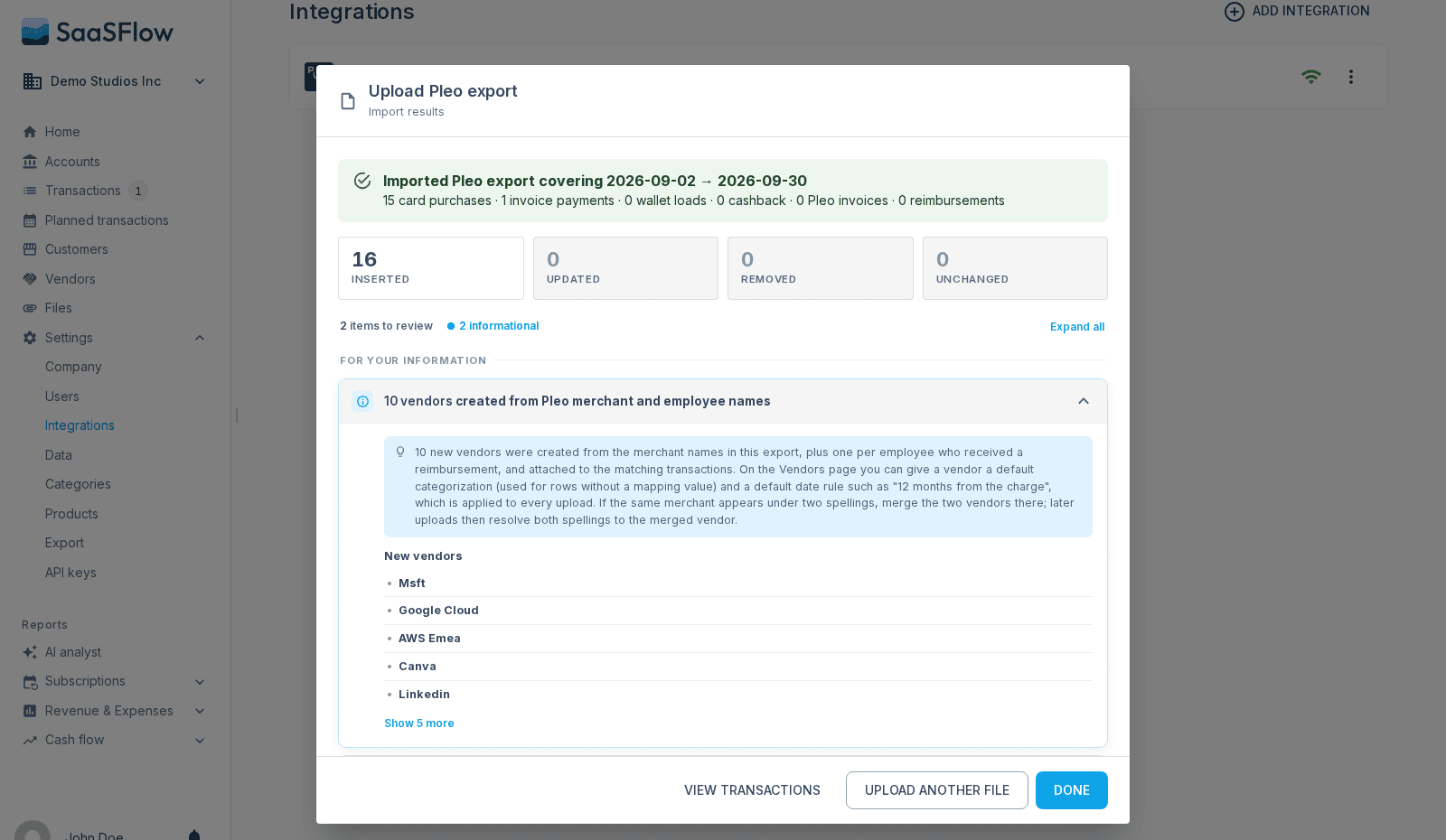
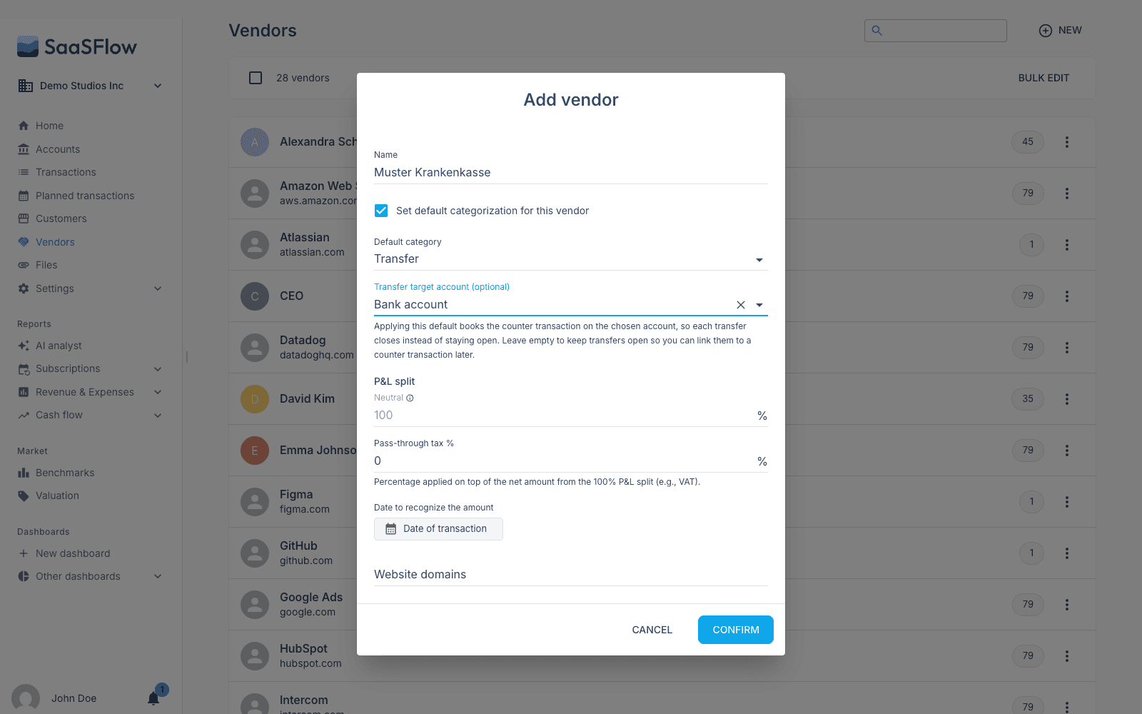
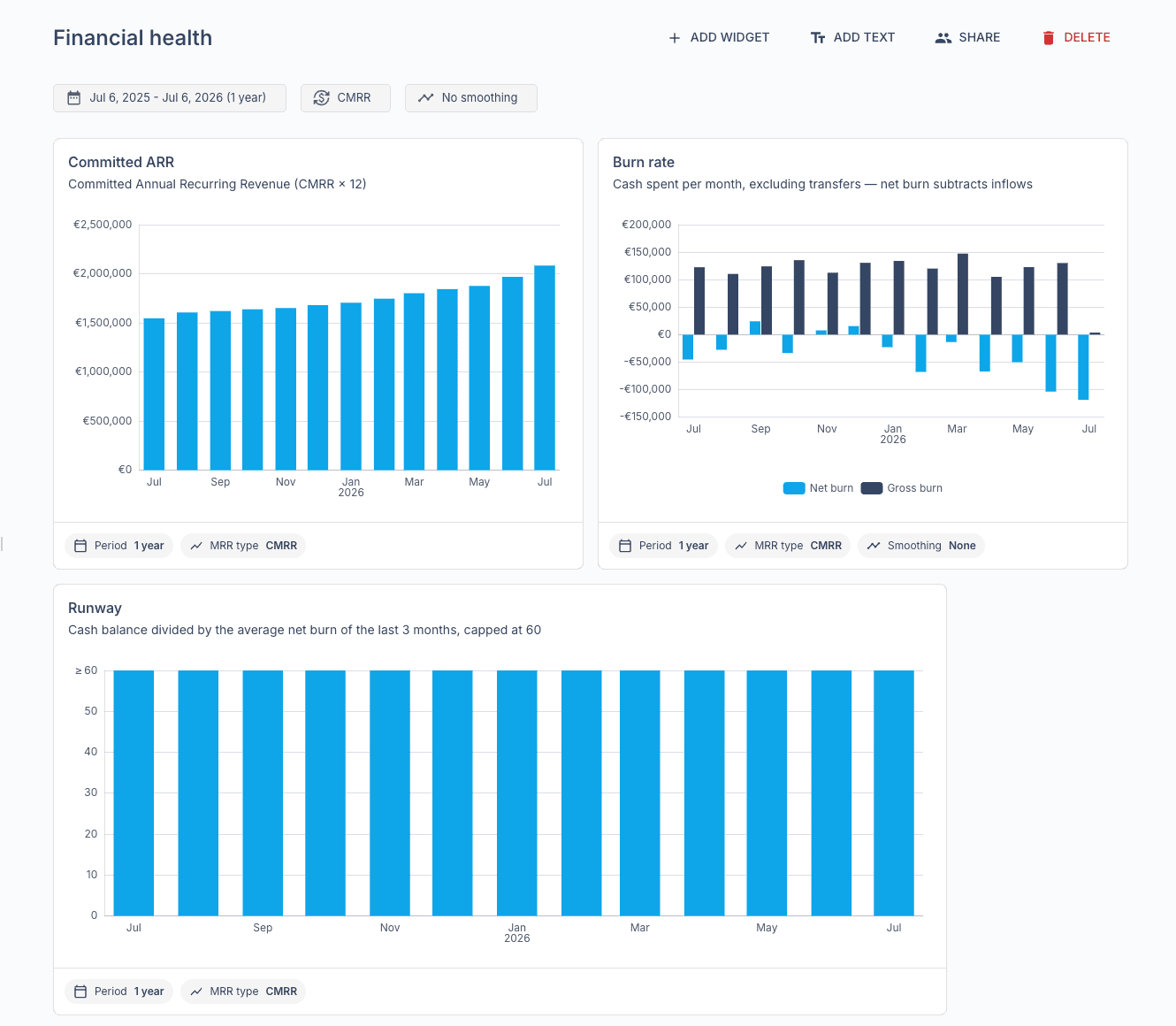
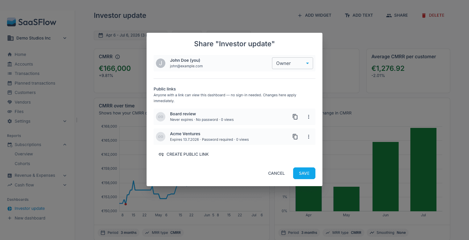
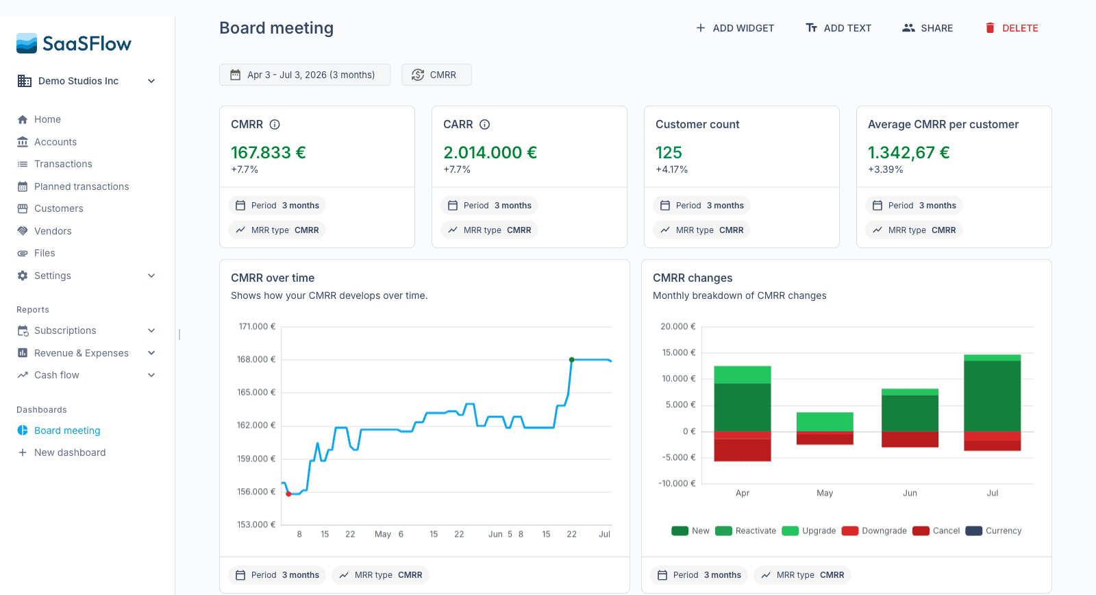
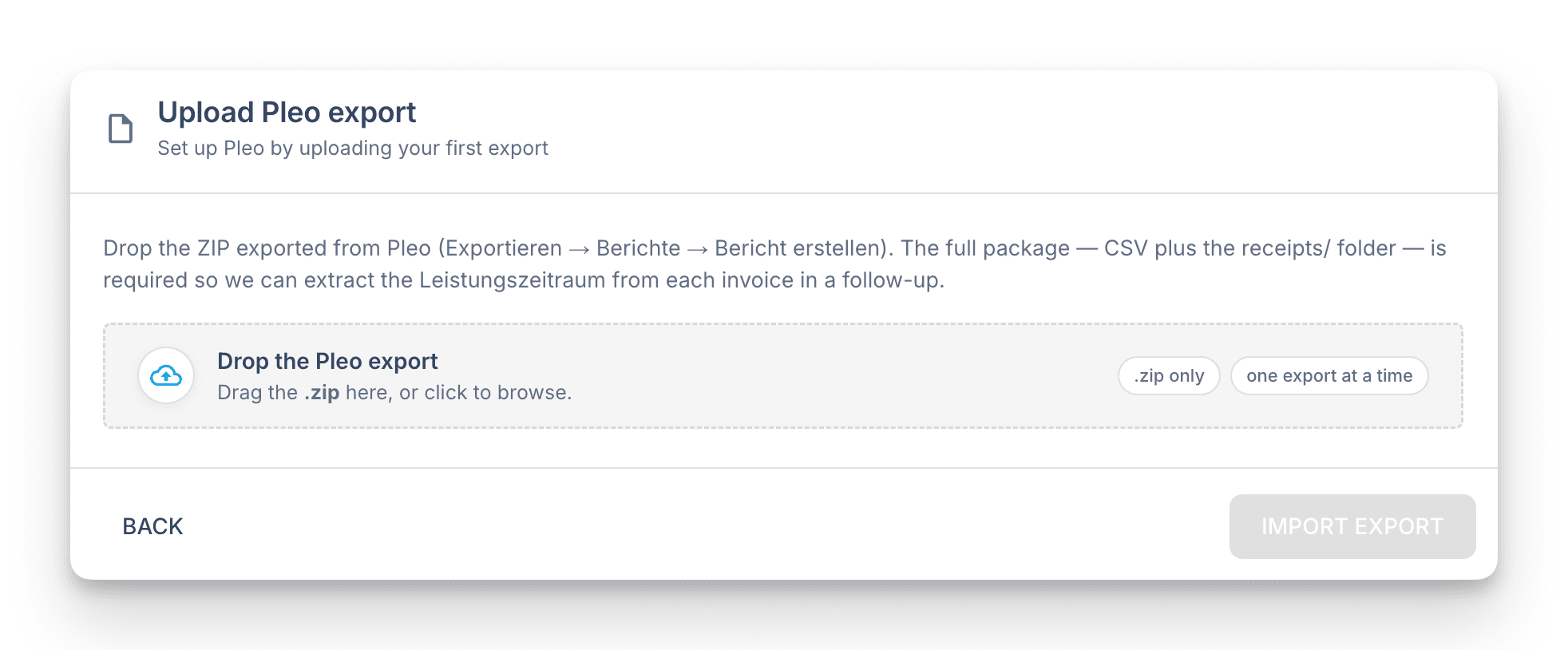
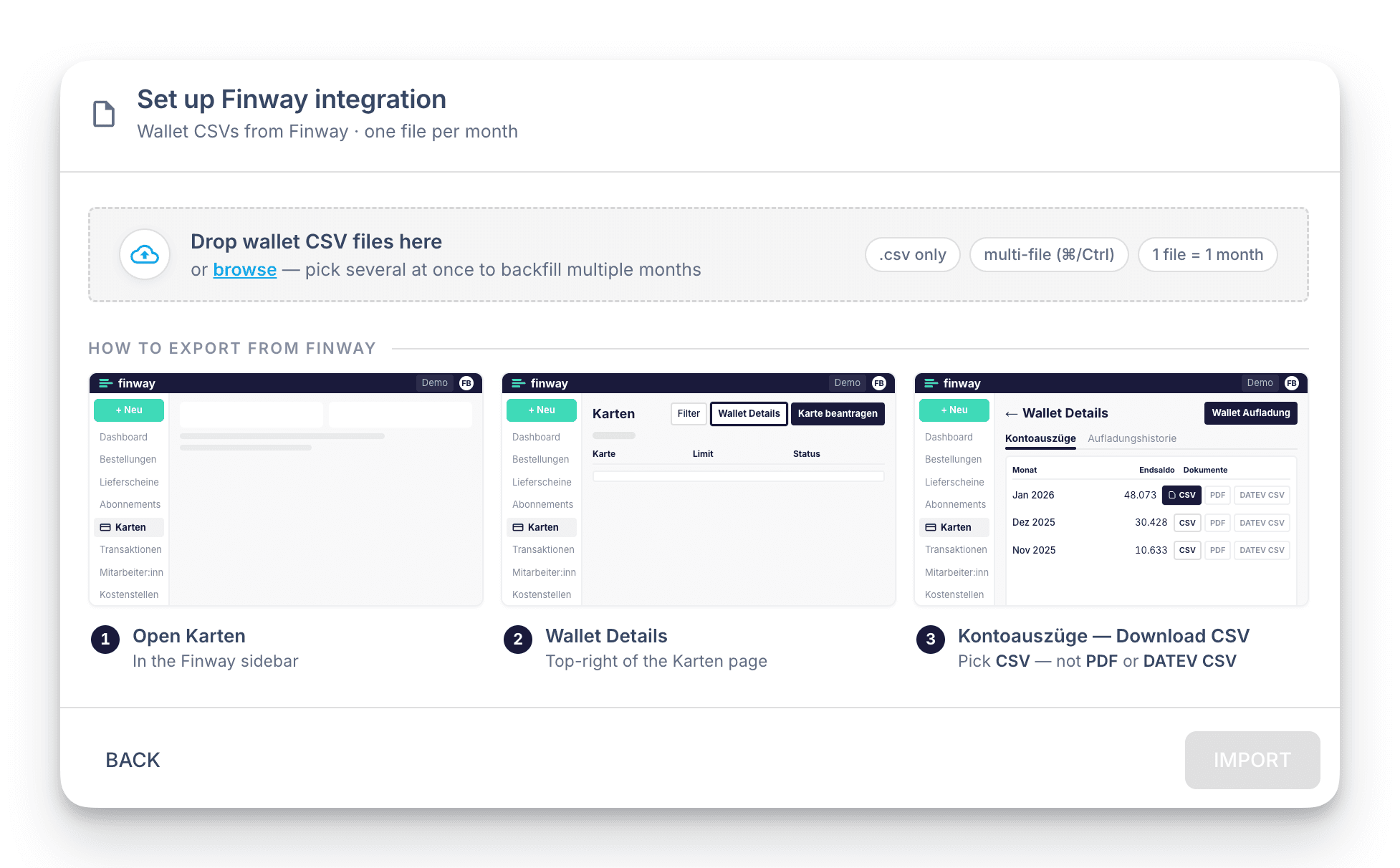
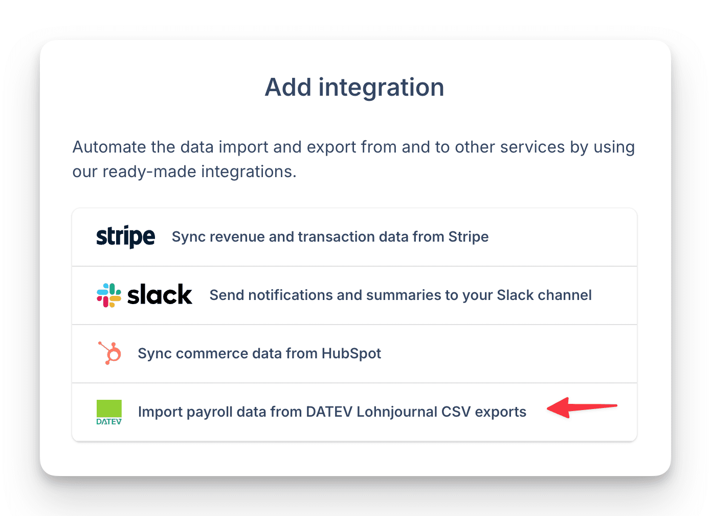
- The agent can also upload Pleo, Finway and DATEV payroll files, build custom dashboards and start syncs.
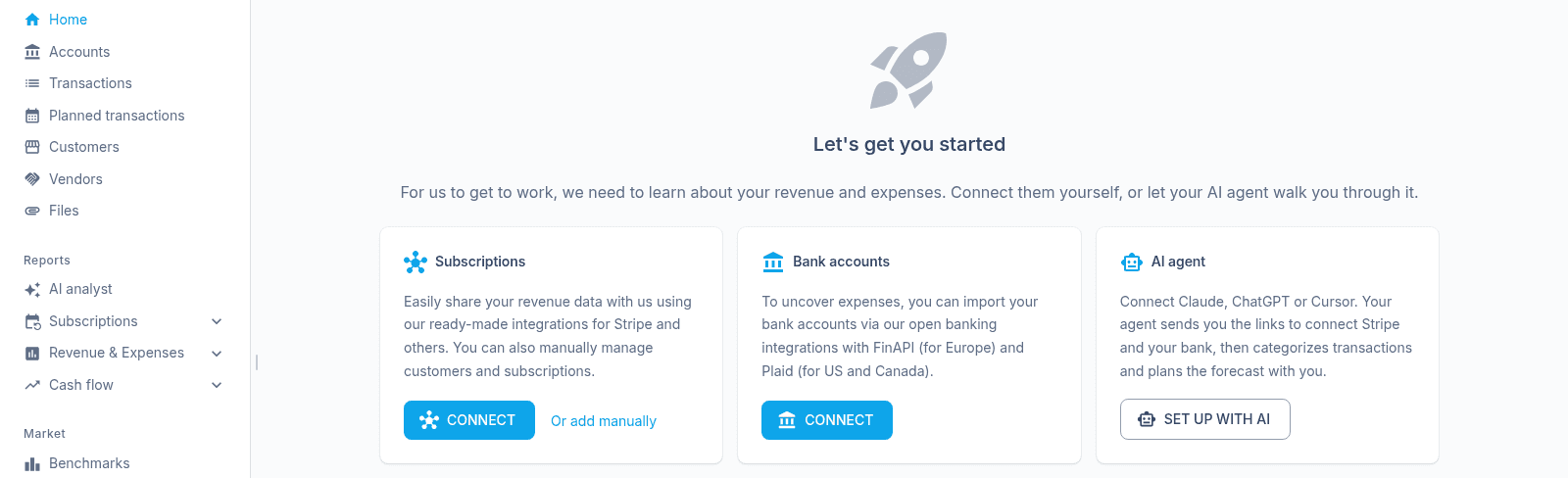
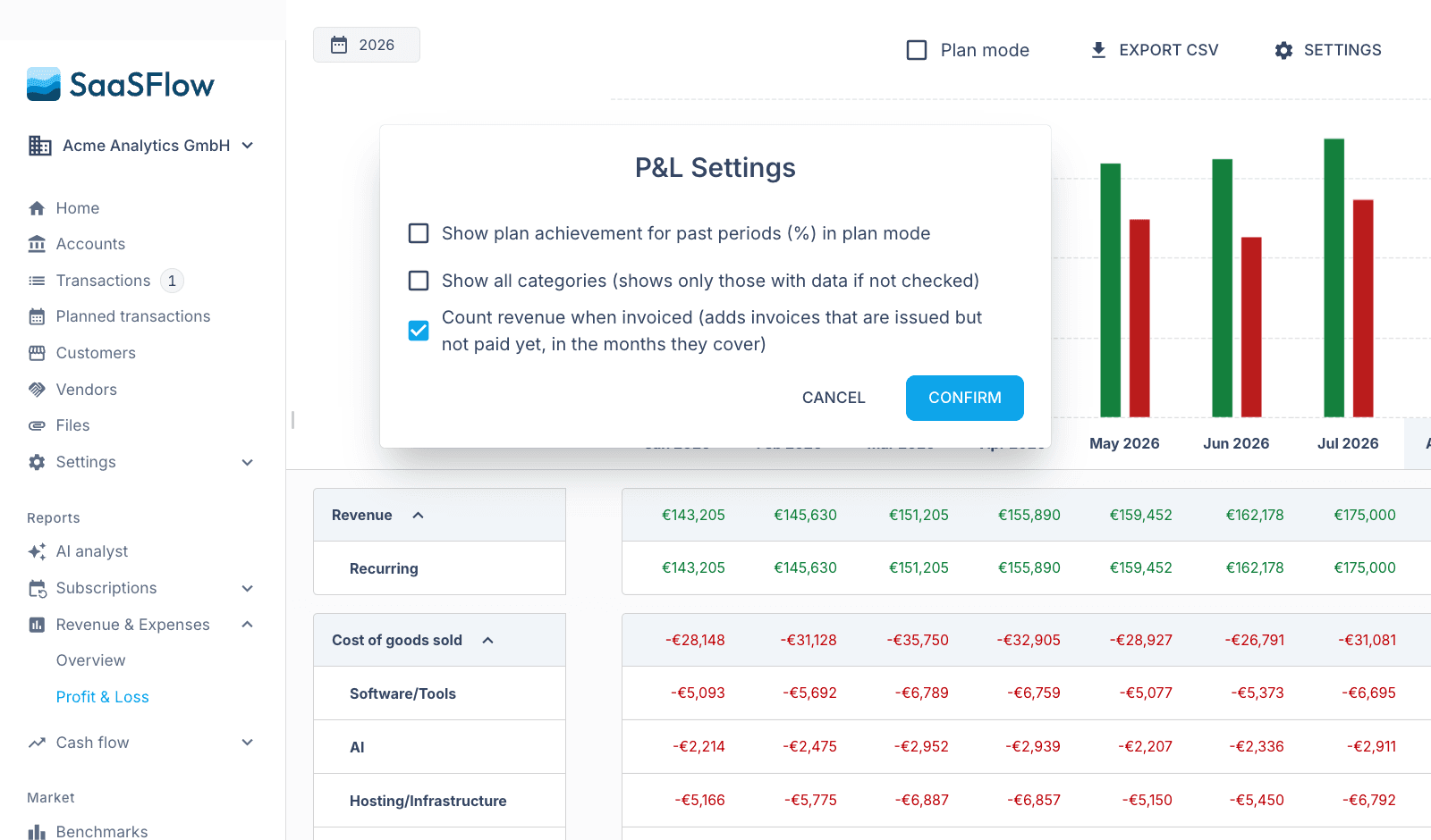
A new company without data now shows a third option on Home: Set up with AI.